Why Do Users Leave a Website? The most common reasons cited by users for leaving a website include slow loading times (up to 88%), responsiveness issues, and poor navigation.[1]
Ask yourself five key questions to evaluate how well your e-commerce site performs in these areas.
What Are Your Page Load Times?
Page load speed has a major impact on conversion rates. Google research shows that each additional second of load time can reduce conversion rates by as much as 20%![1]
What most often slows down page load times?
Lack of site optimization
Too many scripts
Use of uncompressed files
Excessive use of images
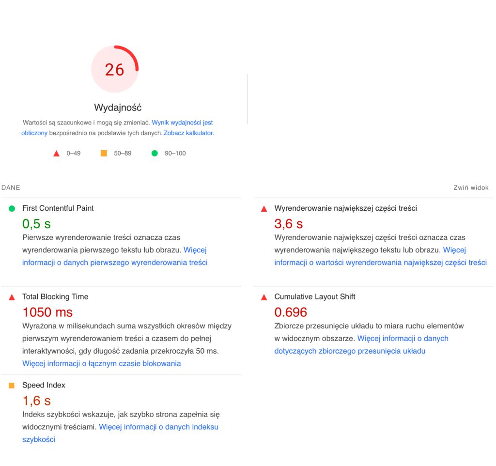
With tools like PageSpeed Insights, you can analyze what’s slowing your website down. Simply enter your URL, and you’ll receive actionable insights that can help improve performance.
Example of load speed analysis results using PageSpeed Insights.
Is Navigation Intuitive?
Intuitive navigation allows users to quickly find the information they need. The easier it is for users to locate the necessary elements, the lower the risk of frustration, which could lead them to abandon your site. Well-designed navigation enhances user engagement and reduces the number of incorrect clicks that disrupt the user experience.
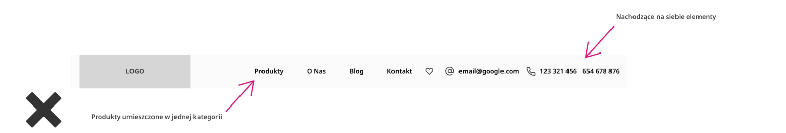
A clear menu structure, categorized content, and accurate labeling help users quickly find what they’re looking for. A menu designed according to UX principles should:
Have a simple, clear structure
Feature intuitively arranged elements
Use plain, understandable language for labels: avoid technical terms that may confuse your audience
Include clear, easily recognizable icons, such as a „favorites list”
Incorporate a search function for faster product or service discovery
Przykłady elementów, na które należy zwrócić uwagę przy projektowaniu menu.
Are Your Forms User-Friendly?
If forms are unintuitive, users may struggle to fill them out, leading to frustration and dissatisfaction. As a result, you may lose potential sales.
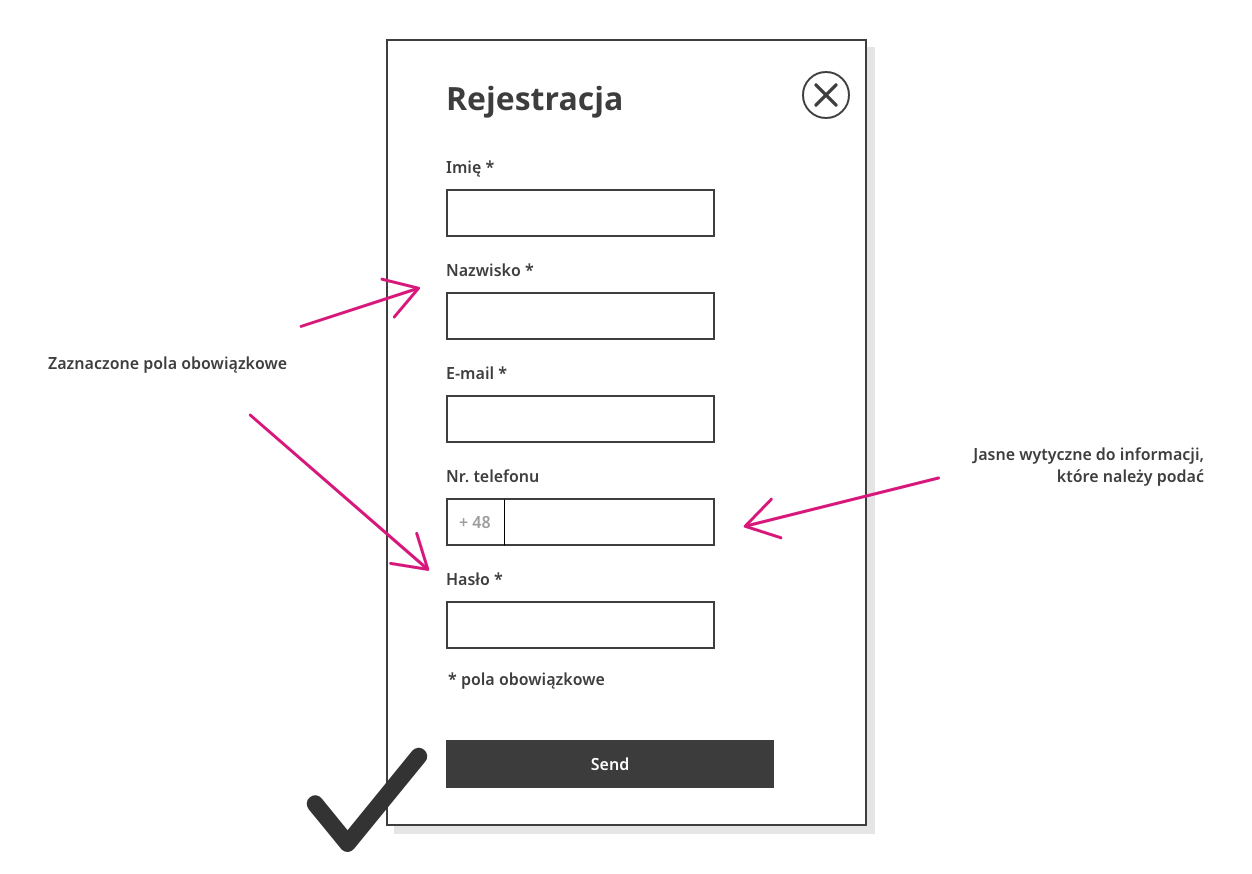
A form designed with User Experience (UX) in mind should:
Be written in simple, clear language so users can easily understand what is required
Clearly present instructions on how to complete the form
Provide feedback on errors and encourage users to correct or add missing information
Show users their progress, indicating which stage they’re currently at
When designing forms, consider their purpose and what essential information you need from users. The shorter the form, the more likely users will complete it. Requiring excessive personal details can reduce user trust.
Important elements to consider when designing forms.
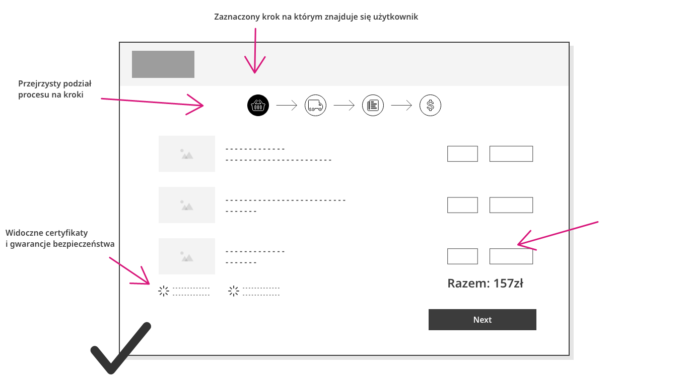
Is the Purchase Process Smooth?
A smooth checkout process boosts customer satisfaction and reduces the risk of cart abandonment. By optimizing the buying process, you can enhance user experience and increase sales.
What defines a smooth checkout process? It’s intuitive for users, and the site is free of errors that might delay the purchase.
Keep in mind that users may navigate this process non-linearly, so adopting a flexible approach to the customer is essential.
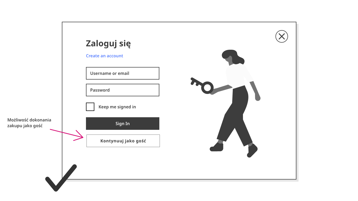
Key elements that influence a seamless checkout process[2]:
Product or service pages should contain all necessary information: descriptions, images, accurate pricing, notifications of any additional fees (e.g., for product modifications), and availability in both online and physical stores
The ability to compare products/services on the site
Information about the number of items added to the cart should always be visible, allowing users to monitor their order and costs while navigating
The option to make purchases as a guest
Allowing users to buy without creating an account simplifies the purchase process.
A transparent, step-by-step order process that clearly outlines benefits and the total order cost
Simple checkout procedures with concise forms
Minimize the number of fields to just the essentials, and ensure validation is done appropriately.
The ability to select preferred payment and delivery methods
Don’t forget to provide tracking options and clear return and refund policies to build trust in your brand.
Is Your Website Responsive and Optimized for Mobile Devices?
Website responsiveness refers to the site’s ability to automatically adjust to different screen sizes. It should function just as effectively and include all the necessary features to ensure a smooth purchase process, whether viewed on a desktop, tablet, or smartphone. E-commerce sites with responsive design provide better usability and efficiency, displaying content clearly and attractively.
Errors in responsive design can negatively impact the quality and usability of websites across devices. Common issues include:
Forms not properly sized for mobile devices, making them difficult or impossible to complete
Too many text or graphic elements, which overwhelm users on smaller screens and distort the site’s layout
Fonts that are not adjusted to screen size, making the content hard to read
Failing to account for touch interactions, leading to poorly sized or placed buttons
Longer load times due to unoptimized graphics for mobile devices
Here are some techniques commonly used in designing responsive e-commerce websites:
Mobile-First Design: This approach begins by designing for mobile screens first, then scaling up by adding or modifying elements for larger screens. This ensures that the website is optimized for smaller screens and works well on all devices (testing is critical), with important elements adapting to screen size.
Image Optimization: Choose images that remain clear when resized or cropped. Using SVG files is especially useful for logos and icons, as they adjust resolution based on image paths, not pixels.
Expandable Cards: These are particularly useful for menus. As the screen size changes, components remain evenly spaced, preventing elements from taking up more space than necessary.
Minimalist Design: A website free from excessive graphics, icons, or text reduces the risk of layout disruptions when screen sizes change. It also ensures that the information is equally visible across devices.
CSS and HTML: HTML structures the content, while CSS adds styles and layout. Using both together allows developers to create flexible designs that adjust to different screen sizes and resolutions.[3]
Key Takeaways and Expert Tips
The most common reasons users leave a site include slow load times, responsiveness issues, poor navigation, and outdated design.
Check your page load times. Tools like PageSpeed Insights can help you understand user experience, website performance, accessibility, and SEO.
Ensure your navigation is straightforward. Users are familiar with certain patterns, and deviating from these may cause confusion and discourage further exploration of your store.
Forms should be simple, clear, and written in user-friendly language. Complex or overly long forms will discourage users from completing them.
A smooth checkout process is critical for success. Pay attention to product page details, how users interact with your site, and ensure that payment and delivery information is easy to find. Reducing the steps between users and their purchase is key.
Test, test, and test again. Check your site’s responsiveness—see how it looks on desktops, smartphones, and tablets. A common mistake is focusing only on one device (typically desktops).
Sources:
[1] Speed influences user experience, Google Support, access: support.google.com [2] User experience in designing the purchasing process, Overlap Studio, access: overlap.studio [3] 5 SEO-Friendly Technologies to Build Responsive Websites, Setupad, access: setupad.com; Responsive Design: Best Practices & Examples, UX Pin, access: uxpin.com
O AUTORCE
Martyna Kowalczuk
Junior UX Designer
Ambitna optymistka, dla której słowa “nie da się” nie istnieją. Gra zespołowo ale chętnie podejmuje się również indywidualnych zadań. Zakochana w UX i zwierzętach, jednak ma nadzieję, że nie zostanie gattarą 🙂
